Dichotomization and statistical testing: part 1
April 4, 2022
Intro
Dichotomization is something widespread in biological sciences. Given a continuous variable, the dichotomization process is performed in order to make its interpreation easier. Usually this is done in the context of survival analysis. An example is gene expression levels that are divided into low and high values or different quantiles. The thresholds used are highly data dependent and thus might be unstable.
This process might be problematic, as we might be inducing effects that are non existent when setting the threshold and dichotomizing continuous variables. In this blog post I show how associations can arise from randomly generated data, and discuss how this is related to p-hacking.
Generating the data
The first step is to generate the random data. A random outcome vector is first generated and will serve as the base to the associations. Then, through n iterations, a random covariate vector is created. By procedure of the null hypothesis statistical test (NHST), in some iterations, we expect to mistakenly find an association between the covariate and the outcome variables. The covariates are then dichotomized using the median as a threshold.
Loading necessary packages
library(dplyr)
library(tidyr)
library(janitor)
library(broom)

library(ggplot2)
options(bitmapType = "cairo")

library(survsim)
library(survival)
Linear regression and association with random covariates
Simulation
In total 5000 simulations are run, each with a sample size of 100. First the random outcome is generated and then random normaly distributed covariates are obtained by sampling the mean and standard deviation from a uniform distribution.
nb_runs <- 5000
nb_samples <- 100
outcome <- rnorm(nb_samples, mean = 0, sd = 2)

results_association <- lapply(
    1:nb_runs,
    function(x, outcome){

        mean_normal <- runif(1, min = 0, max = 3)
        sd_normal <- runif(1, min = 0, max = 3)
        random_covariate <- rnorm(nb_samples, mean = mean_normal, sd = sd_normal)

        list(
            results = lm(
                outcome ~ random_covariate
            ) %>% broom::tidy() %>% .[2, ],
            random_covariate = random_covariate
        )
    },
    outcome = outcome
)

results_association_vals <- lapply(
    results_association,
    function(x) x$results
) %>% dplyr::bind_rows()
Checking and plotting the results
Due to the nature of p-values, one can expect to see 5% of the p-values to be smaller than 0.05.
color_text <- "blue"
results_association_vals %>% ggplot2::ggplot(aes(x = p.value)) +
    ggplot2::geom_histogram(bins = 20) +
    ggplot2::geom_vline(xintercept = 0.05, linetype = "dashed", color = color_text) +
    ggplot2::annotate(
        "text",
        x = 0.02,
        y = 200,
        label = "0.05",
        color = color_text
    ) +
    ggplot2::theme_bw()

The histogram above looks like a uniform distribution. With the usual 0.05 significance level, the proportion of iterations in which the null hypothesis was rejected is:
mean(results_association_vals$p.value < 0.05) * 100
## [1] 4.86
as expected from the uniform distribution of p-values.
Dichotomizing the continuous variables
In this step the continuous covariate is dichotomized and means of the two groups are compared. Again we expect a uniform distribution of the p-values. The trick used here is the fact the slope of the linear regression corresponds to the difference of means.
results_dichotomy <- lapply(
    results_association,
    function(x, outcome){
        random_covariate <- x$random_covariate
        dichotomy <- random_covariate > median(random_covariate)

        lm(outcome ~ dichotomy) %>%
            broom::tidy() %>% .[2, ]
    },
    outcome = outcome
) %>% dplyr::bind_rows()
And below is the plot of the p-value distribution based on the dichotomized simulation.
color_text <- "blue"
results_dichotomy %>% ggplot2::ggplot(aes(x = p.value)) +
    ggplot2::geom_histogram(bins = 20) +
    ggplot2::geom_vline(xintercept = 0.05, linetype = "dashed", color = color_text) +
    ggplot2::annotate(
        "text",
        x = 0.05*2,
        y = 200,
        label = "0.05",
        color = color_text
    ) +
    ggplot2::labs(
        title = "p-value distribution of the dichotomized associations"
    ) +
    ggplot2::theme_bw()
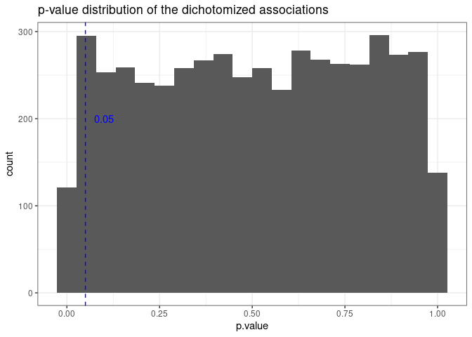
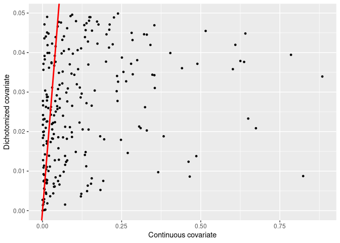
It looks as expected. The plot below shows the relation between the p-values of the continuous covariate and the p-values of their dichotomized version
final_pvalues <- data.frame(
    continuous = results_association_vals$p.value,
    dichotomy = results_dichotomy$p.value
)

final_pvalues %>% ggplot2::ggplot(aes(x = continuous, y = dichotomy)) +
    ggplot2::geom_point(size = 0.5) +
    ggplot2::geom_abline(slope = 1, intercept = 0, color = "red", size = 1) +
    ggplot2::labs(
        x = "Continuous covariate",
        y = "Dichotomized covariate"
    )

In principle, there is not relationship between the p-values of the continuous and dichotomized covariate.
Let us focus now on the dichotomized covariates that are actually statistically significant and analyse the p-values from the continuous covariates.
final_pvalues %>%
    dplyr::filter(dichotomy < 0.05) %>%
    ggplot2::ggplot(aes(x = continuous, y = dichotomy)) +
    ggplot2::geom_point(size = 1) +
    ggplot2::geom_abline(slope = 1, intercept = 0, color = "red", size = 1) +
    ggplot2::labs(
        x = "Continuous covariate",
        y = "Dichotomized covariate"
    )
This plot shows that several dichotomized covariates showed an association to the outcome, despite the fact that the continuous covariate showed p-values ranging from 0 to 1.
The process done previously can be extended to multiple thresholds, such as those based on different quantiles. Given that multiple tests are done, the chances of getting a p-value smaller than 0.05 increases, leading to a spurious result. This process is a type of p-hacking.
Conclusion
Dichotomization is a process that can be manipulated. By doing this process, one increases the chances of finding an effect that is not there, leading to p-hacking. Not only this, the power is heavily decreased, since a lot of the data is discarded when setting thresholds based on quantiles.
If dichotomization is really necessary, care should be taken and the threshold should be well justified with data, simulations and expert knowledge.
In the next blog post I show a simulation example using survival data. Stay tuned!
Acknowledgments
A big thank you to Thiago for his comments and suggestions. Thank you also to Emir and Markus for their opinions and comments on the draft.