Dichotomization in survival analysis: part 2
April 15, 2023
Survival analysis
In this blog post I will guide you on the effects of dichotomization
when performing survival analysis, more specifically when using the
proportional hazards cox regression. For this effect, we use the package
simsurv in R and we will assume parametric distributions for the
baseline hazard. The simsurv is a great package for simulating survival
data, it also provides a lot of flexibility in the sense you can
simulate data under flexible baseline hazards, not following
standard parametric distributions. To perform cox regression we use
the package survival.
Simulation of continuous covariates
It is very common in biomedical literature to dichotomize a continuous variable and perform kaplan meier. Here we will generate survival data and perform a similar analysis, so instead of using the outcome previously defined, we use the survival data.
We focus now only on continuous covariates and how their dichotomization can lead to spurious results. Note here that usually in the biomedical literature observational data is used in this context and most of the times researchs fail to adjust for the necessary confounders. We will not deal with this problem now, perhaps in a future post. The covariate we will be simulating and trying to understand can be anything found in the literature. But to make things more concrete, let us assume we are simulating normalized gene expression levels.
In the next chunk we simulate survival data whose baseline hazard follow a Weibull baseline hazard, with parameter $\gamma = 1.5$ and $\lambda = 0.1$. The Weibull distribution is parametrized in the following form:
\[S_i(t) = \exp(-\lambda (t^\gamma) \exp(X_i^T\beta)),\]where $\lambda > 0$ and $\gamma > 0$ are the scale and shape parameters respectively, $beta$ is the coefficients of the covariates and $X_i$ is a vector with the covariate values for patient $i$.
The distribution of the covariate of interest changes for each iteration. We draw the mean and standard deviations from a uniform distribution each with range 0 to 3. The $beta$ in the survival function will always be $0$, since we want to show the effect of dichotomization here.
The function used to do the simulations is shown in the appendix of this blogpost so we get directly to the results.
First we generate the simulation results.
sim_results <- parallel::mclapply(
    1:nb_runs,
    sim_run,
    mc.cores = 4
)
Now we can perform the pvalue comparisons between the dichotomized and continuous variable cox regression models.
survival_results_association_vals <- lapply(
    sim_results,
    function(x){
        dplyr::bind_rows(
            x[c("results", "results_cont")],
            .id = "dich_cont"
        )
    }
) %>% dplyr::bind_rows()
We first start checking the p-value distribution for the simulations. We expect to see a uniform distribution for both cases by definition.
# plot the p-value distribution
color_text <- "blue"
survival_results_association_vals %>%
    ggplot2::ggplot(aes(x = p.value)) +
    ggplot2::geom_histogram(bins = 30) +
    ggplot2::geom_vline(xintercept = 0.05, linetype = "dashed", color = color_text) +
    ggplot2::annotate(
        "text",
        x = 0.05*2,
        y = 1,
        label = "0.05",
        color = color_text
    ) +
    ggplot2::facet_wrap(~term) +
    ggplot2::theme_bw()
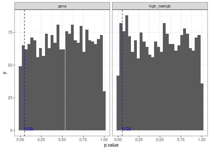
The distribution looks like a uniform distribution. There are several statistically significant results, and the probability of getting a statistically significant association is
mean(survival_results_association_vals[
    survival_results_association_vals$term == "gene",
]$p.value < 0.05)
## [1] 0.056
which is very close to 0.05 as expected from a uniform distribution.
We can now plot the p-values for both types of analysis, dichotomous and continuous variables, in a scatter plot.
survival_final_pvalues <- survival_results_association_vals %>%
    tidyr::pivot_wider(
        id_cols = "iter",
        names_from = "term",
        values_from = "p.value"
    ) %>%
    dplyr::rename(continuous = gene, dichotomy = high_lowhigh)

survival_final_pvalues %>%
    ggplot2::ggplot(aes(x = continuous, y = dichotomy)) +
    ggplot2::geom_point(size = 1) +
    ggplot2::geom_abline(slope = 1, intercept = 0, color = "red", linewidth = 1) +
    ggplot2::theme_bw()
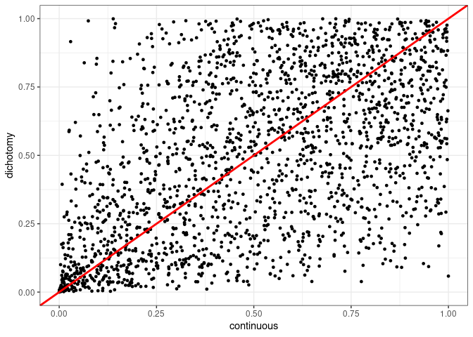
The situation here is the same as before. Let us check the dichotomized covariates that achieved statistical significance and compare to the p-value of the continuous variable. The vertical dashed line goes through 0.05 on the x-axis.
survival_final_pvalues %>%
    dplyr::filter(dichotomy < 0.05) %>%
    ggplot2::ggplot(aes(x = continuous, y = dichotomy)) +
    ggplot2::geom_point(size = 1) +
    ggplot2::geom_abline(
        slope = 1,
        intercept = 0,
        color = "red",
        linewidth = 1
    ) +
    ggplot2::geom_vline(xintercept = 0.05, linetype = "dashed") +
    ggplot2::theme_bw()
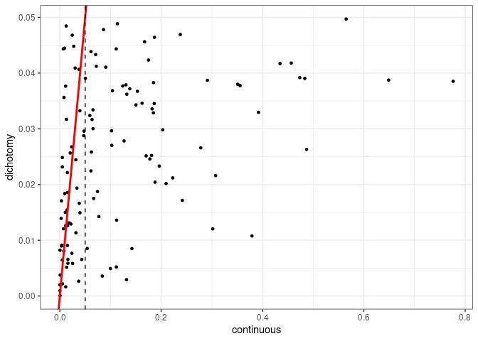
A very similar pattern to the previous blog post. Dichotomization might give us a different interpretation as if we were to use a continuous variable. In the end we see that the relationships we get is the same as when we are using linear regression.
We now turn our attentions to the hazard ratios (HRs) obtained. Due to the nature of the simulations we expect most of the hazard ratios to be close to 1. In the figure (a) below we see that for the continuous values we get some hazard ratios spread from 0 to 2. But when you dichotomize the hazard ratios go from 0.5 to around 1.5, so it is more compact. On the other hand, when we look at the distributions themselves (figure (b)), the HRs for the continuous covariate have a distribution that is more tightly concentrated around 1, as expected, whereas for the dichotomous the distribution is wider.
# first obtain the hazard ratios
survival_final_hrs <- survival_results_association_vals %>%
    dplyr::mutate(estimate = exp(estimate)) %>%
    # we filter to HRs below 2 as there are a few values that are
    # extremely large
    dplyr::filter(estimate < 2) %>%
    tidyr::pivot_wider(
        id_cols = "iter",
        names_from = "term",
        values_from = "estimate"
    ) %>%
    dplyr::rename(continuous = gene, dichotomy = high_lowhigh) %>%
    tidyr::drop_na()

# first a scatter plot of the HRs for both continuous and dichotomous variables
p1 <- survival_final_hrs %>%
    ggplot2::ggplot(aes(x = continuous, y = dichotomy)) +
    ggplot2::geom_point(size = 1) +
    ggplot2::geom_vline(xintercept = 1, color = "red", linetype = "dashed") +
    ggplot2::geom_hline(yintercept = 1, color = "red", linetype = "dashed") +
    ggplot2::theme_bw(base_size = 10) +
    ggplot2::labs(
        title = paste0(
            "Hazard Ratios of cox regression from randomly",
            "\ngenerated gene expression levels"
        )
    ) +
    # we limit to 0 and 2 because of a few outliers that would prevent us
    # from seeing all the other points
    ggplot2::coord_cartesian(xlim = c(0, 2), ylim = c(0, 2))

# comparison of the HR distribution for both cases
p2 <- survival_results_association_vals %>%
    dplyr::mutate(estimate = exp(estimate)) %>%
    dplyr::filter(estimate < 2) %>%
    dplyr::mutate(type_analysis = ifelse(
        dich_cont == "results",
        "dichotomous",
        "continuous"
    )) %>%
    ggplot2::ggplot(aes(x = estimate, fill = type_analysis)) +
    ggplot2::geom_density(alpha = 0.5, position = "identity") +
    ggplot2::labs(
        x = "Hazard ratio",
        y = "Density",
        fill = "Type of analysis",
        title = "Comparison of the hazard ratio distributions"
    ) +
    ggplot2::theme_bw(base_size = 10)

cowplot::plot_grid(p1, p2, ncol = 2, labels = "auto")

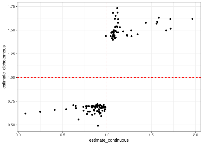
Now the figure below shows only the hazard ratios that have a p-value smaller than 0.05. For the continous cases they range from something close to 1 up to 1.6 or 0.3 (both directions). On the other hand, for the dichotomous variable, the values they are around either 1.5 or 0.7.
survival_results_association_vals %>%
    dplyr::mutate(estimate = exp(estimate)) %>%
    dplyr::filter(estimate < 2) %>%
    dplyr::mutate(term = ifelse(
        term == "gene",
        "continuous",
        "dichotomous"
    )) %>%
    tidyr::pivot_wider(
        id_cols = "iter",
        names_from = "term",
        values_from = c("p.value", "estimate")
    ) %>%
    dplyr::filter(p.value_dichotomous < 0.05) %>%
    tidyr::drop_na() %>%
    ggplot2::ggplot(aes(y = estimate_dichotomous, x = estimate_continuous)) +
    ggplot2::geom_point() +
    ggplot2::geom_vline(xintercept = 1, color = "red", linetype = "dashed") +
    ggplot2::geom_hline(yintercept = 1, color = "red", linetype = "dashed") +
    ggplot2::theme_bw()
The strategy of dichotomizing by just taking the median is one option. Another option is to take the quantiles, usually the 30% and 70% percentiles. We now perform the simulation by dichotomizing based on the quantiles. Note that when doing so we lose power, as we will be discarding samples that are in between the quantiles.
# Perform 100 replicates in simulation study
sim_results_quantiles <- parallel::mclapply(
    1:nb_runs,
    sim_run,
    dichotomization = "quantile",
    mc.cores = 4
)

df <- dplyr::bind_rows(list(
    # first dataframe is from the median dichotomization
    median = survival_results_association_vals %>%
        dplyr::mutate(estimate = exp(estimate)) %>%
        dplyr::filter(estimate < 2) %>%
        dplyr::mutate(type_analysis = ifelse(
            dich_cont == "results",
            "dichotomous",
            "continuous"
        )) %>%
        dplyr::filter(type_analysis == "dichotomous"),
        # second dataframe is from the quantile dichotomization
    quantile = lapply(
            sim_results_quantiles,
            function(x){
                dplyr::bind_rows(
                    x[c("results", "results_cont")],
                    .id = "dich_cont"
                )
            }
        ) %>%
        dplyr::bind_rows() %>%
        dplyr::mutate(estimate = exp(estimate)) %>%
        dplyr::filter(estimate < 2) %>%
        dplyr::mutate(type_analysis = ifelse(
            dich_cont == "results",
            "dichotomous",
            "continuous"
        )) %>%
        dplyr::filter(type_analysis == "dichotomous")
    ),
    .id = "type_dichotomization"
)

p1 <- df %>%
    ggplot2::ggplot(aes(x = estimate, fill = type_dichotomization)) +
    ggplot2::geom_density(position = "identity", alpha = 0.3) +
    ggplot2::labs(
        x = "Hazard ratio",
        y = "Density",
        fill = "Dichotomization"
    ) +
    ggplot2::theme_bw()

p2 <- df %>%
    dplyr::filter(p.value < 0.05) %>%
    ggplot2::ggplot(aes(x = estimate, fill = type_dichotomization)) +
    ggplot2::geom_density(position = "identity", alpha = 0.3) +
    ggplot2::labs(
        x = "Hazard ratio",
        y = "Density",
        fill = "Dichotomization"
    ) +
    ggplot2::theme_bw()

cowplot::plot_grid(p1, p2)

We see that by using quantiles the distribution of the hazard ratios gets slightly bigger, due to the fact we are making the distinction between the groups bigger.
Conclusion
Similarly to the part 1 of this series, results in survival analysis can be gamed. Also the interpretation might change when using different threshold cutoffs.
Appendix
The code used to run the simulations is shown below.
nb_samples <- 200
nb_runs <- 2000

# Define a function for analysing one simulated dataset
sim_run <- function(i, dichotomization = "median", confounder = FALSE){

    # Create the dataframe with the subejct IDS and the covariate
    # values simulating a z-normalized gene expression
    mean_cov <- runif(1, min = 0, max = 3)
    sd_cov <- runif(1, min = 0, max = 3)

    if (confounder){
        # we now create the dataframe with a confounder and the
        # gene expression levels depending on the confounder
        effect_ts <- 0.4
        mean_ts <- runif(1, min = 0, max = 3)
        sd_ts <- runif(1, min = 0, max = 0.5)

        cov <- data.frame(
            id = 1:nb_samples,
            tumor_size = rnorm(nb_samples, mean = mean_ts, sd = sd_ts)
        ) %>%
            # this is where we create the gene expression levels
            dplyr::mutate(
                gene = effect_ts * tumor_size +
                    rnorm(nb_samples, mean = mean_cov, sd = sd_cov)
            )
    } else {
        cov <- data.frame(
            id = 1:nb_samples,
            gene = rnorm(nb_samples, mean = mean_cov, sd = sd_cov)
        )
    }


    # Simulate the event times. Here we use a weibull distribution
    # for the baseline hazard. we restrict to 5 years the followup time,
    # if more than that, patient is censored
    betas <- if (confounder) c(gene = 0, tumor_size = 1) else c(gene = 0)
    df <- simsurv::simsurv(
        lambdas = 0.1,
        gammas = 1.5,
        betas = betas,
        x = cov,
        dist = "weibull",
        maxt = 5
    ) %>%
        # Merge the simulated event times onto covariate data frame
        dplyr::inner_join(., cov, by = "id")

    if (dichotomization == "median"){

        # we now dichotomize based on the median. In this case it is the
        # same as the mean since we are generating the gene expression
        # levels from a normal distribution
        df <- df %>%
            dplyr::mutate(high_low = ifelse(
                gene > median(gene),
                "high",
                "low"
            )) %>%
            dplyr::mutate(high_low = factor(
                high_low,
                levels = c("low", "high")
            ))

        # survival with the dichotomized values
        surv_results <- survival::coxph(
            survival::Surv(eventtime, status) ~ high_low,
            data = df
        )

        if (confounder){
            surv_results_ts <- survival::coxph(
                survival::Surv(eventtime, status) ~ high_low + tumor_size,
                data = df
            )
        }


    } else if (dichotomization == "quantile") {
        quantiles_genes <- quantile(cov$gene, c(0.3, 0.7))
        df <- df %>%
            dplyr::mutate(high_low = dplyr::case_when(
                gene > quantiles_genes[2] ~ "high",
                gene < quantiles_genes[1] ~ "low",
                TRUE ~ "none"
            )) %>%
            dplyr::mutate(high_low = factor(
                high_low,
                levels = c("low", "high", "none")
            ))

        # survival with the dichotomized values
        surv_results <- survival::coxph(
            survival::Surv(eventtime, status) ~ high_low,
            data = df %>%
                dplyr::filter(high_low != "none")
        )

        if (confounder){
            surv_results_ts <- survival::coxph(
                survival::Surv(eventtime, status) ~ high_low + tumor_size,
                data = df %>%
                    dplyr::filter(high_low != "none")
            )
        }

    }


    # survival with the continuous values
    surv_results_cont <- survival::coxph(
        survival::Surv(eventtime, status) ~ gene,
        data = df
    )

    if (confounder){

        surv_results_cont <- survival::coxph(
            survival::Surv(eventtime, status) ~ gene,
            data = df
        )

        surv_results_cont_ts <- survival::coxph(
            survival::Surv(eventtime, status) ~ gene + tumor_size,
            data = df
        )

        list(
            results = surv_results %>%
                broom::tidy() %>%
                dplyr::mutate(iter = i),
            results_ts = surv_results_ts %>%
                broom::tidy() %>%
                dplyr::mutate(iter = i),
            results_cont = surv_results_cont %>%
                broom::tidy() %>%
                dplyr::mutate(iter = i),
            results_cont_ts = surv_results_cont_ts %>%
                broom::tidy() %>%
                dplyr::mutate(iter = i),
            gene = df,
            surv = surv_results,
            surv_cont = surv_results_cont,
            surv_ts = surv_results_ts,
            surv_cont_ts = surv_results_cont_ts
        )

    } else {

        list(
            results = surv_results %>%
                broom::tidy() %>%
                dplyr::mutate(iter = i),
            results_cont = surv_results_cont %>%
                broom::tidy() %>%
                dplyr::mutate(iter = i),
            gene = df,
            surv = surv_results,
            surv_cont = surv_results_cont
        )
    }
}